There’s something especially meaningful about planning a wedding for a couple who first experienced your work as guests. Rebecca and Tim attended a Harding Waterfront Estate wedding I planned the year prior, so when they reached out to plan their own wedding at the same venue, it felt like a full-circle moment, and truly such an honour.
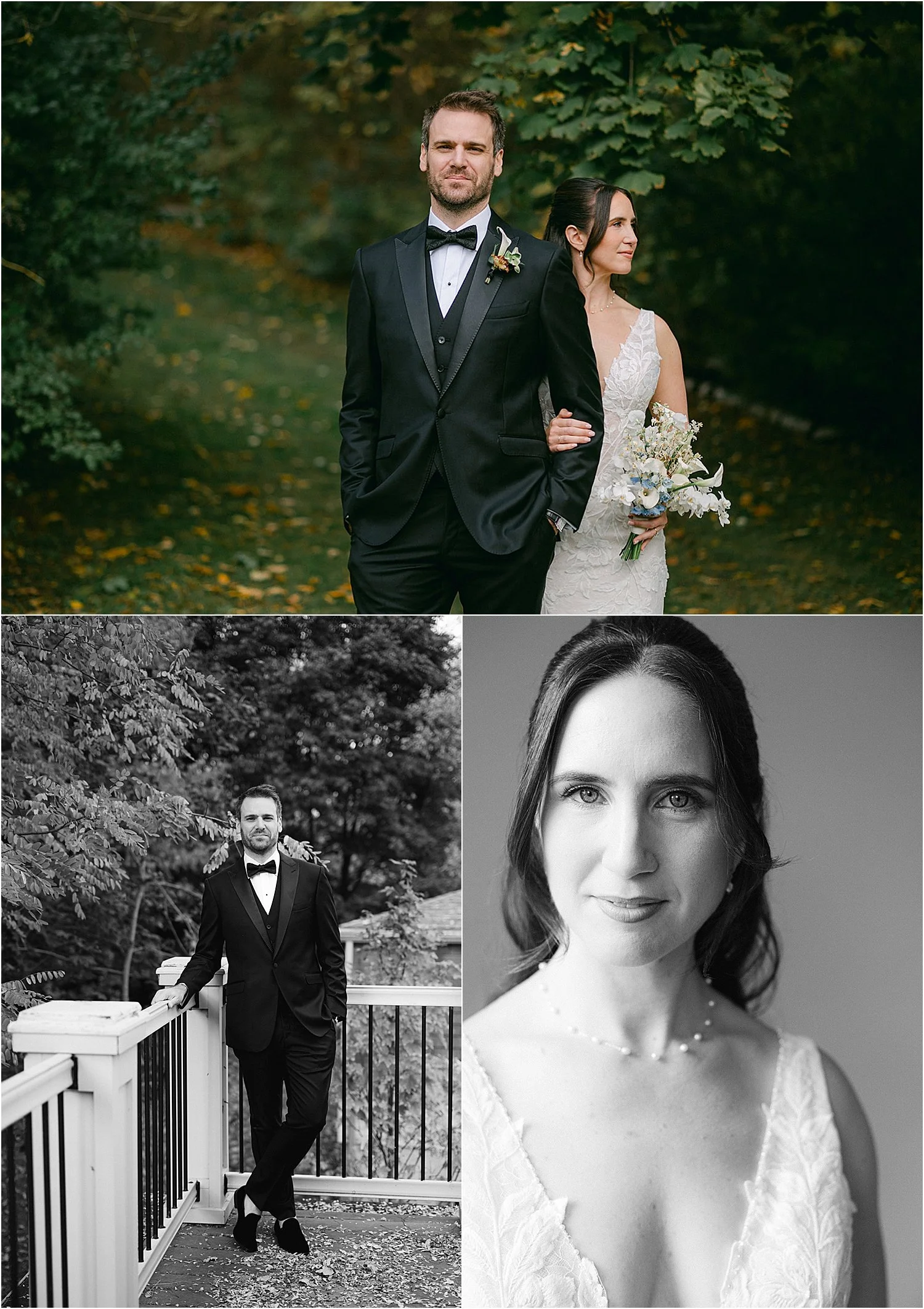
Their October 24, 2025 wedding at Harding Waterfront Estate was a masterclass in thoughtful restraint, layered pattern, and intentional colour. From the moment they shared their initial vision of soft blue and white, they were completely open to my guidance on expanding the palette and pushing the design just enough to feel elevated, unique and unexpected.
Expanding the Colour Palette with Intention
While light blue and white formed the foundation, we built depth by introducing cappuccino brown, teal, terracotta, and subtle hints of dark green. The result was a palette that felt warm and autumnal without leaning too seasonal - perfect for a late October wedding on the waterfront.
Rather than overwhelming the space, each colour had a role. Teal anchored the graphic elements, terracotta warmed the stationery details, and cappuccino brown grounded the overall design, allowing the softer blues to feel intentional rather than overly sweet.
Pattern Mixing Done Thoughtfully
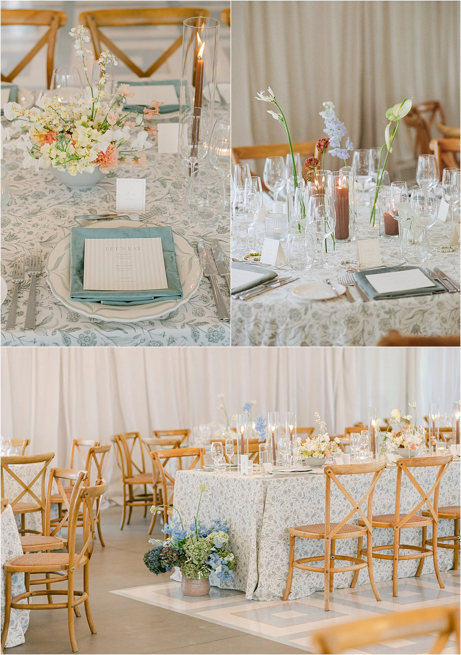
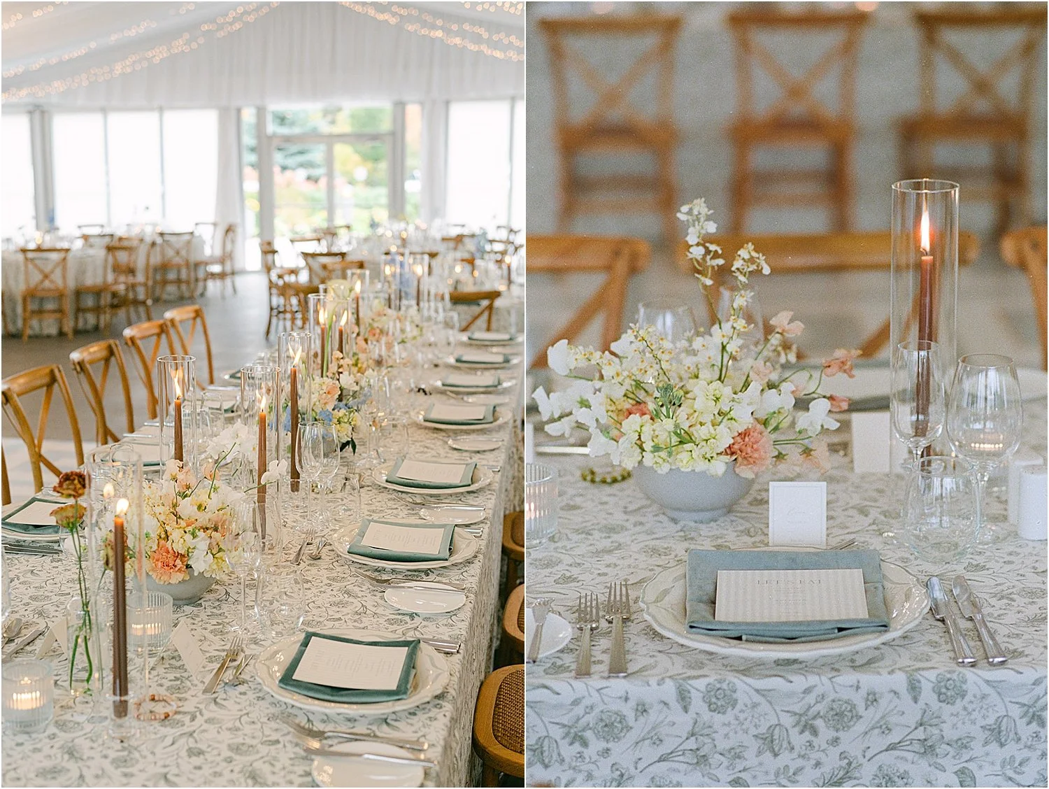
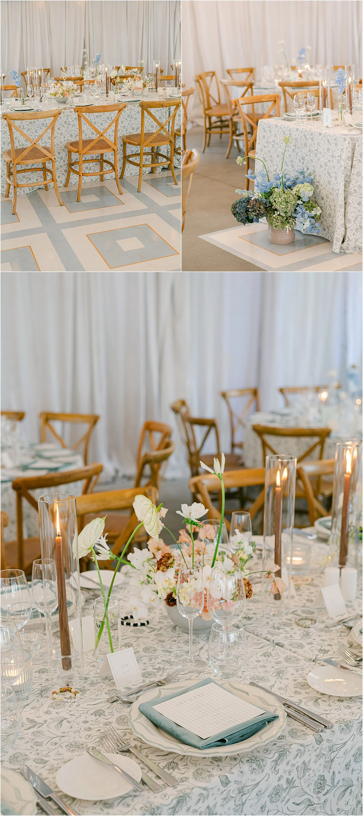
Rebecca and Tim were completely open to pattern which is a dream for any designer. We layered soft stripes, organic florals, and geometric squares, using teal tones throughout to maintain cohesion and ensure a seamless visual transition between elements.
The custom geometric dance floor vinyl became the anchor of the reception space, visually grounding the room and setting the tone for the entire design. Pattern mixing can easily feel chaotic, but when done thoughtfully, it creates rhythm and movement, especially in a space as naturally elegant as Harding Waterfront Estate.
I was ridiculously excited to see all of the patterns come together, particularly once the room was fully set. This is where I always come back to my design philosophy: it’s not about more being more - it’s about doing things exceptionally well. When design elements are executed at a high level, they create impact without visual clutter.
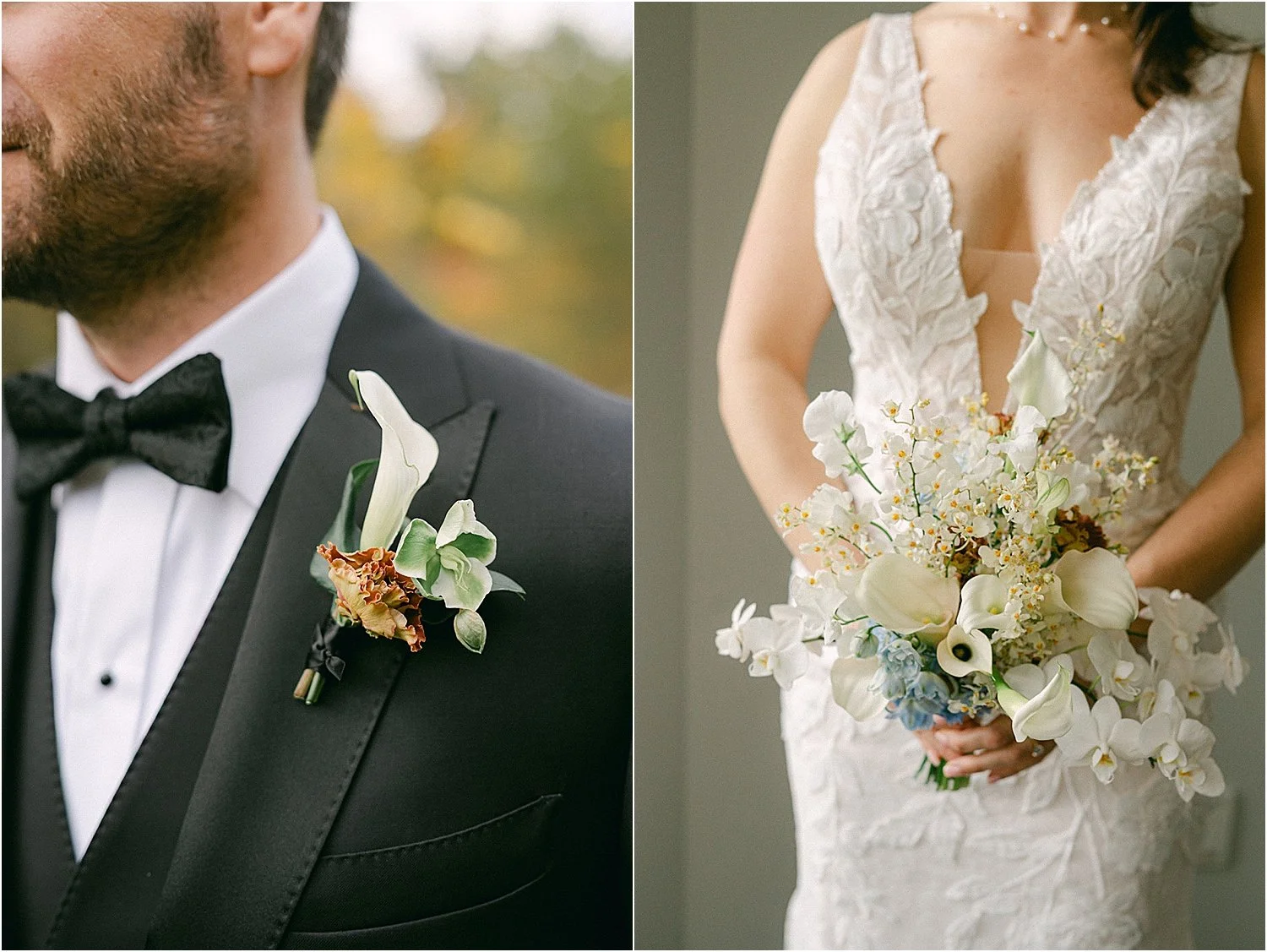
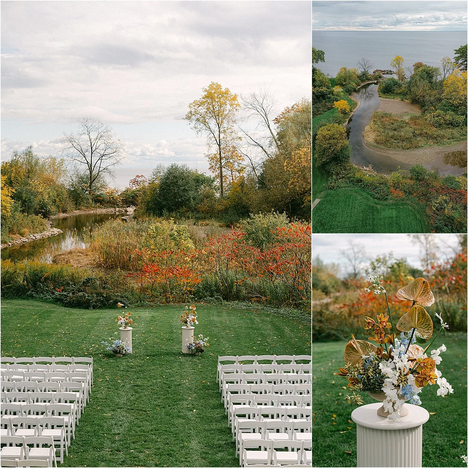
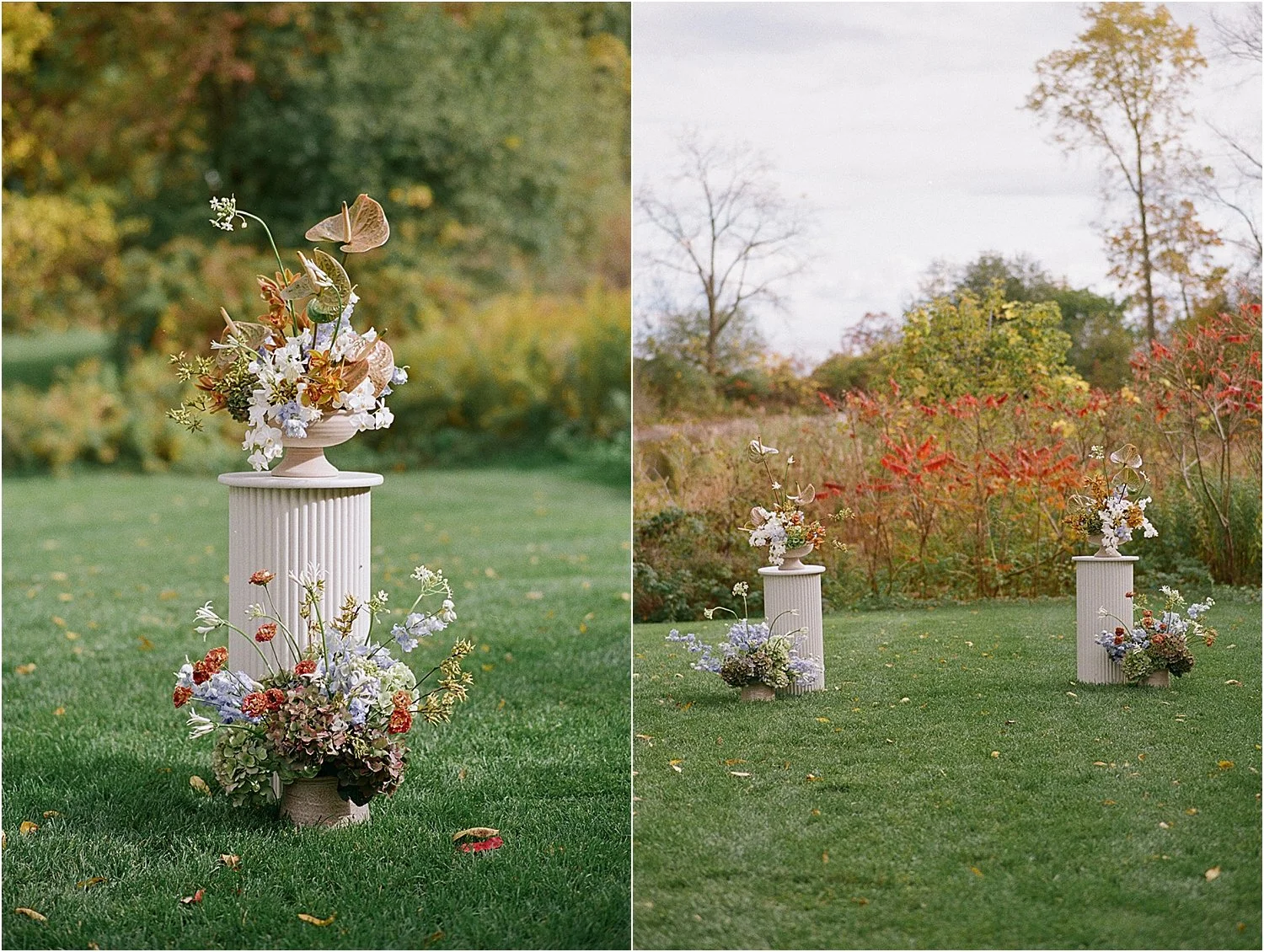
Florals as Art at Harding Waterfront Estate
Toronto wedding florist Rosalie Villanueva took our design direction and elevated it beyond expectation. Each floral arrangement felt like a sculptural piece of art—intentional, organic, and beautifully composed.
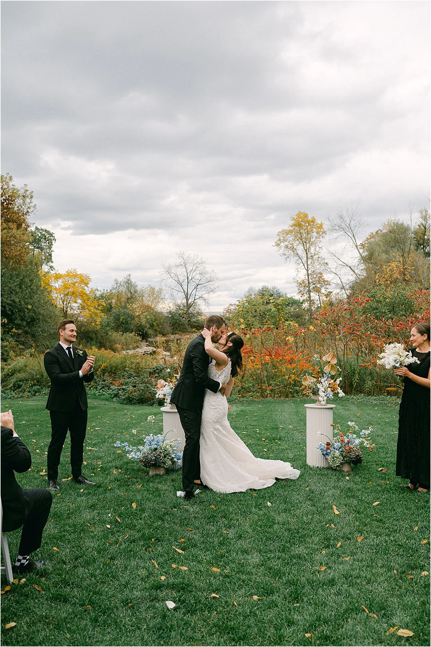
The ceremony at Harding Waterfront Estate requires very little enhancement. The grounds feel tucked away from the world, offering a quiet, almost secret-garden quality that’s rare for a Toronto waterfront wedding venue. We allowed the setting to speak for itself, framing the ceremony with florals that enhanced rather than competed with the natural surroundings.
To maximize impact, ceremony arrangements were repurposed for the ends of the VIP tables during the reception. Repurposing ceremony florals in a way that feels natural is a strategy I often use to create cohesion while being mindful of both budget and sustainability.
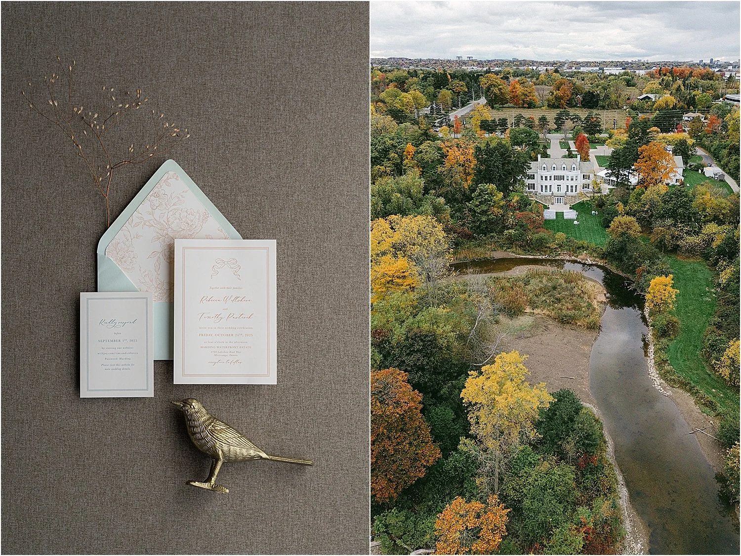
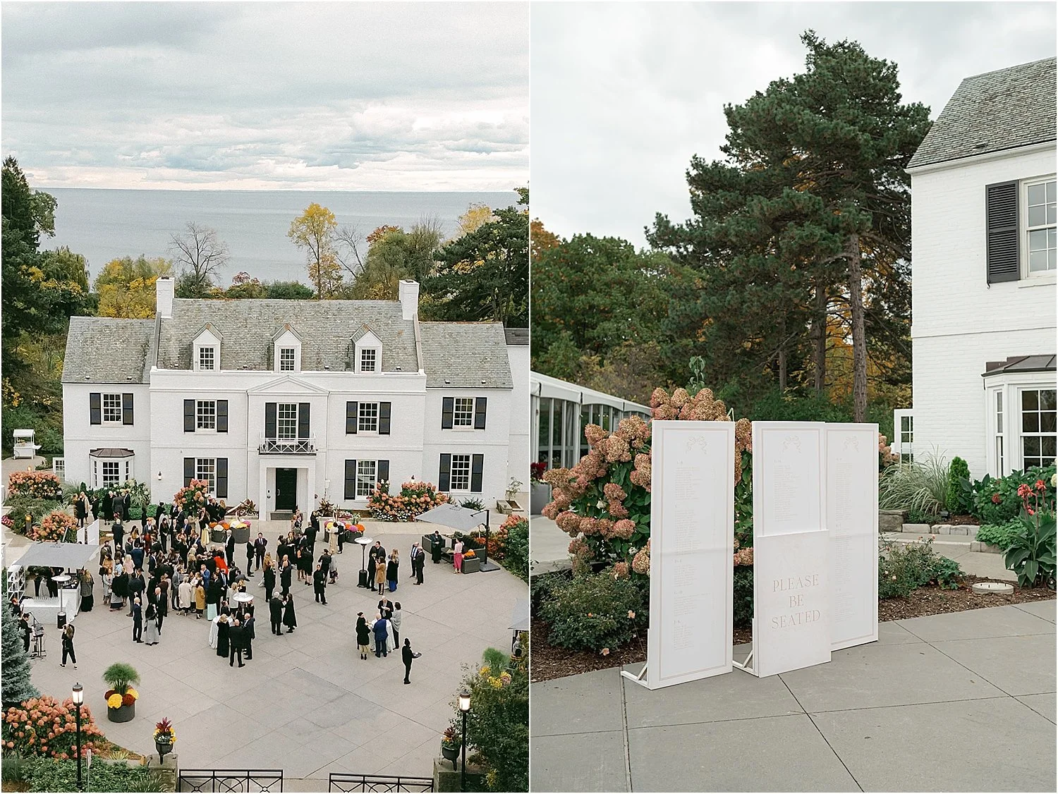
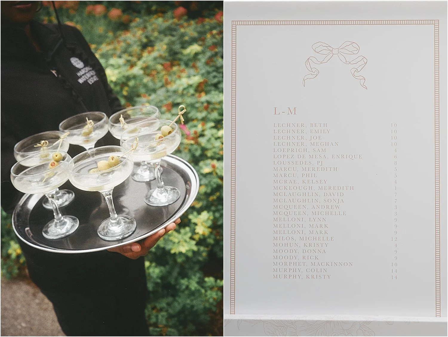
Stationery That Subtly Set the Tone
Amber from All That’s Lovely ran with our inspiration beautifully. The invitation suite featured soft blue envelopes, ivory paper, and a mix of teal and terracotta inks, creating a subtle colour-blocked effect that hinted at the design story without revealing everything at once.
While bows and ribbons have been trending, I always prefer a more nuanced approach. We incorporated a romantic bow line drawing throughout the stationery, from invitations to wedding day paper goods, as a gentle nod to the trend rather than an overt statement. The result felt timeless, refined, and perfectly aligned with Rebecca and Tim’s aesthetic.
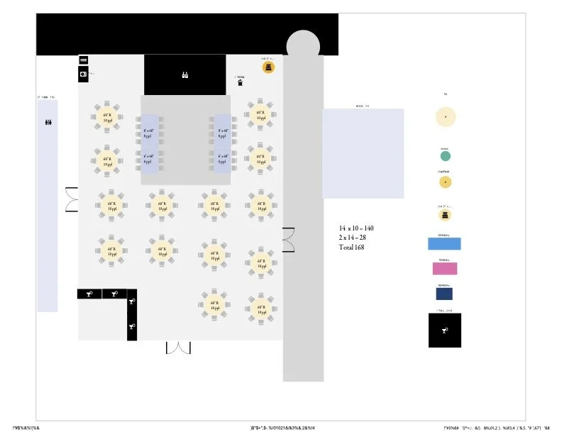
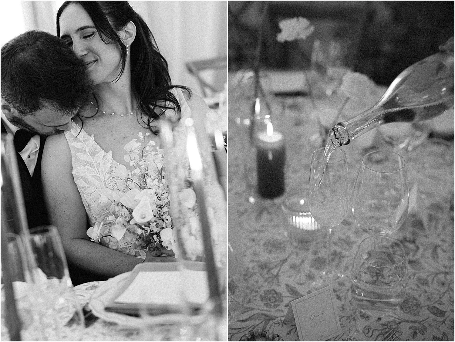
A Reception Layout with Impact
Instead of a traditional head table, Rebecca and Tim opted for two long VIP tables flanking the dance floor. This layout choice made a huge visual statement, especially against the bold geometry of the dance floor vinyl, and encouraged a more communal, celebratory atmosphere.
The symmetry of the tables, paired with layered patterns and sculptural florals, created a reception design that felt intentional from every angle, one of the many reasons Harding Waterfront Estate weddings photograph so beautifully.
Why Harding Waterfront Estate Is One of Toronto’s Most Unique Wedding Venues
Harding Waterfront Estate remains one of the most distinctive wedding venues in the Toronto area. With its lakefront views, lush grounds, and on-site tent, it offers couples the rare combination of privacy, flexibility, and natural beauty.
For Rebecca and Tim, it was the perfect canvas for a wedding that balanced softness with structure, tradition with creativity, and design-forward thinking with genuine warmth.
This wedding will stay with me for a long time. Not just because of the design, but because of the trust Rebecca and Tim placed in the process. When couples are open, collaborative, and excited to explore ideas together, the result is always something truly special.
With that, I invite you to experience their Harding Waterfront Estate wedding below, beautifully captured by Alix Gould.
Alix Gould Photography, RZY by Rosalie Villanueva, Harding Waterfront Estate, All You Need is Love (officiant), ES Bridal, Simply Beautiful Decor, All That’s Lovely, Dance Floor Graphics, and Parkside Drive.
Rebecca and Tim’s Reception Layout at Harding Waterfront Estate